
FROM CASK RELIC TO BREWING LAB:
REBRANDING ABC FOR VALE BREWERY
THE PROBLEM
ABC had always been part of the Vale Brewery story, but it had started to feel like a bit of a forgotten relic.
It was the badge the team pulled out when they had time to experiment. A chance to try new styles, push recipes a little further and play outside the core Vale range.
Vale had spent the previous few years strengthening the main brewery brand and building a much more consistent core range. Once that work had settled in, ABC became the obvious next opportunity.
The idea behind the brand was already strong: If Vale is the classics, ABC is the lab. New styles, bolder recipes, and new formats. One brew per month and never repeated.
The problem was simple. The brand did not yet look like the lab..
OUR SOLUTION
We worked with Joe, Jimmy and the Vale team to give ABC a visual identity of its own.
This was not about giving an old badge a quick polish. ABC needed to feel separate from the main Vale range, while still clearly belonging to the same brewery.
We explored what ABC meant inside the wider Vale world, who it was there to attract, and how far we could push the visual language without losing people completely.
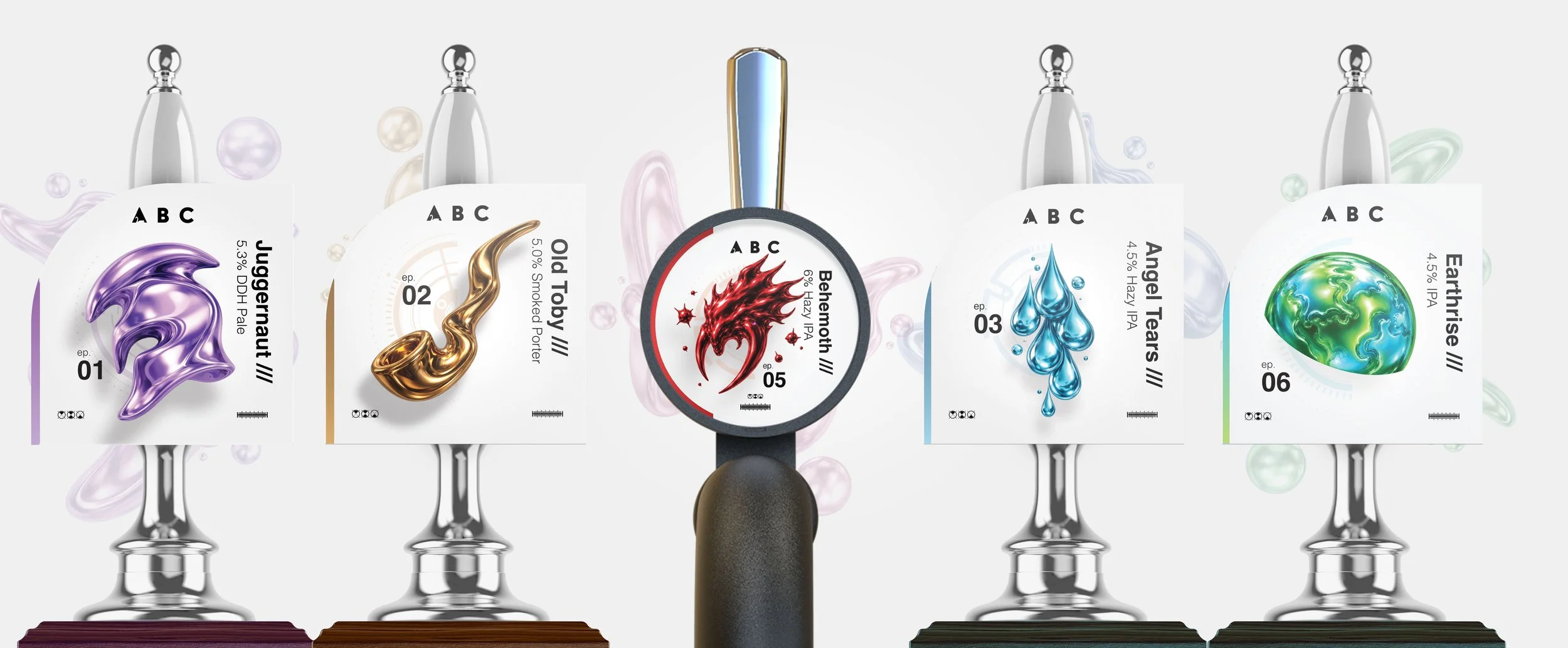
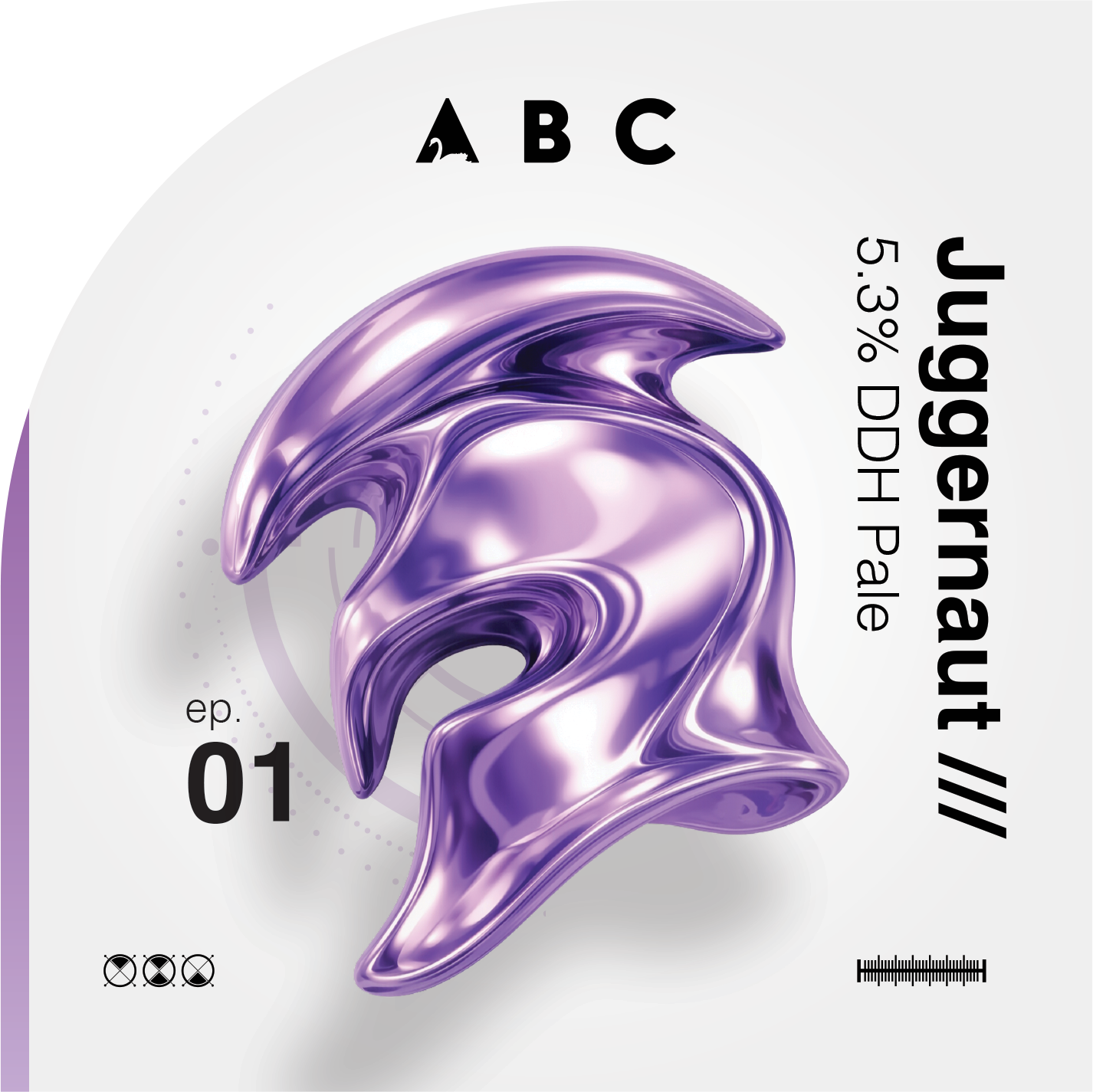
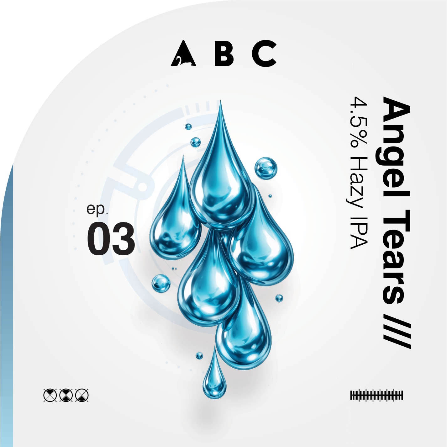
The final route took inspiration from science, sci-fi and experimental forms. Clean, modern, abstract and deliberately different from the usual visual cues you see across cask beer.
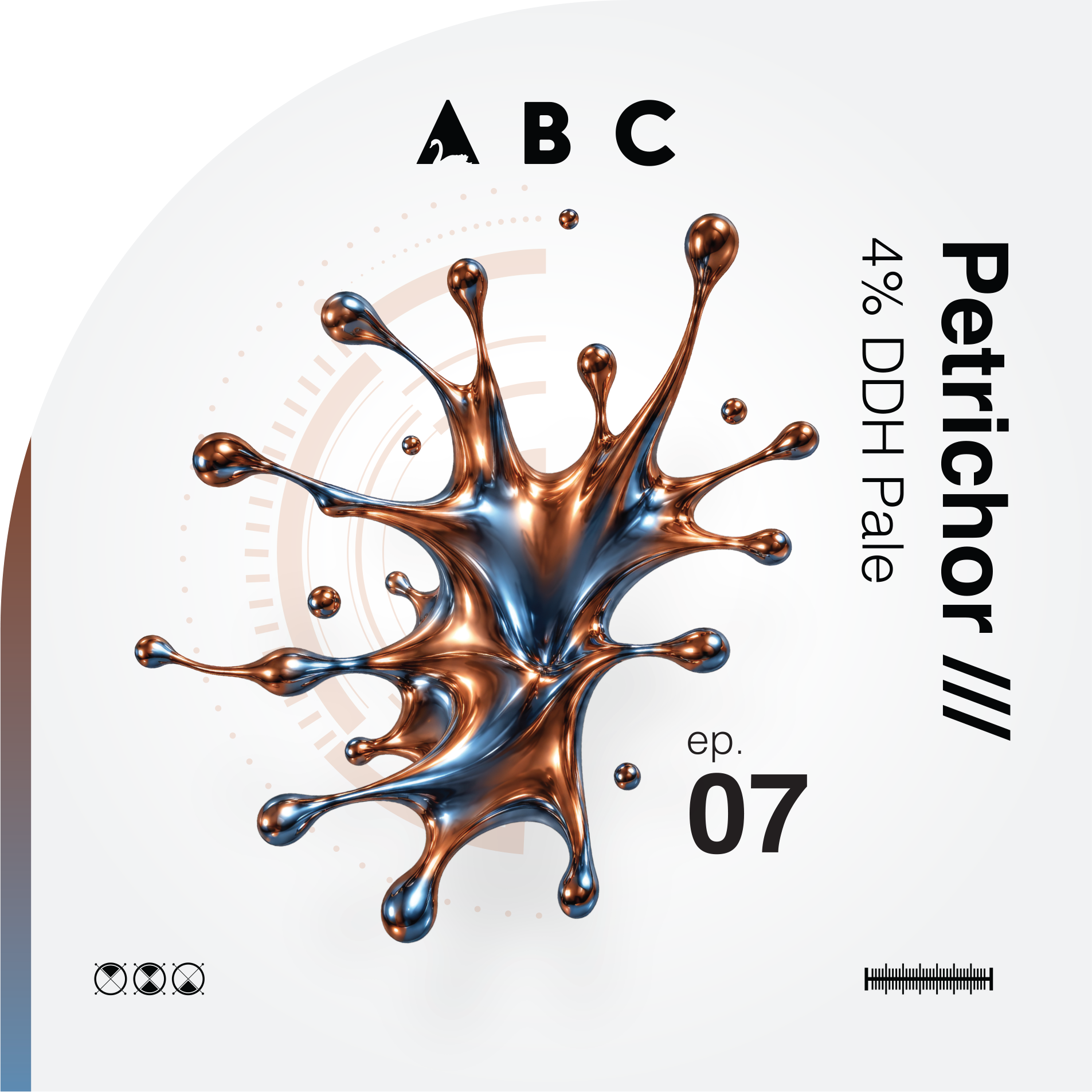
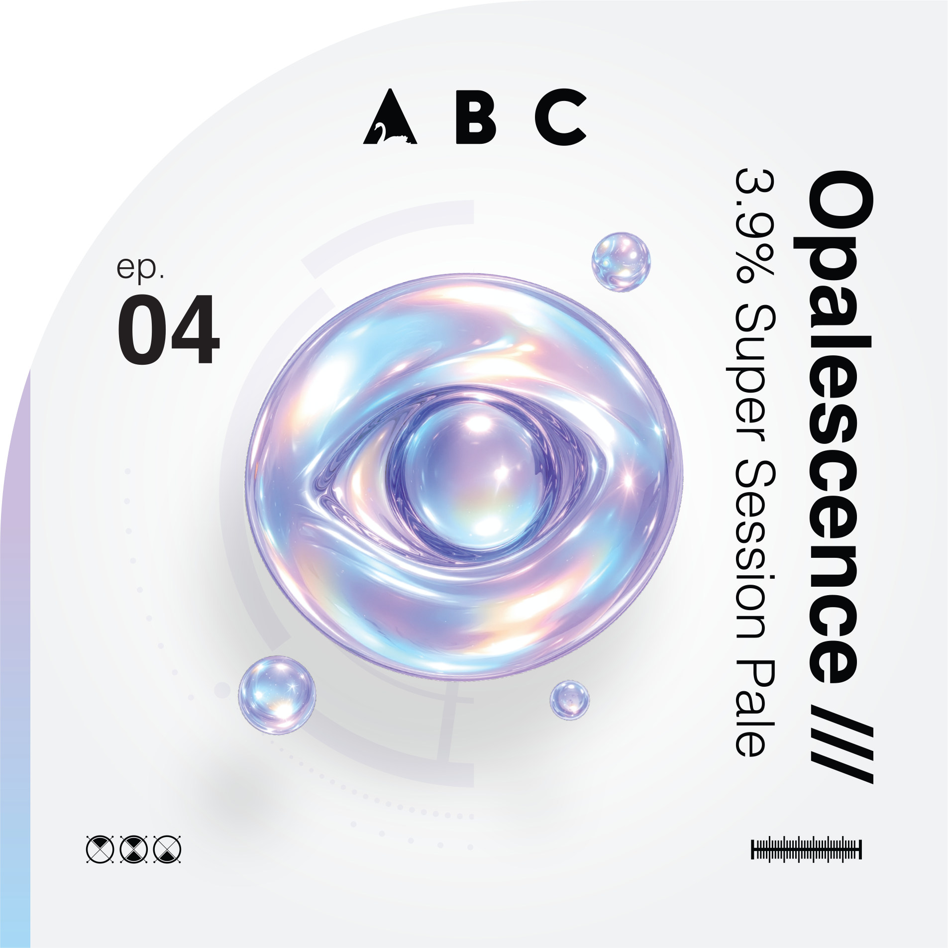
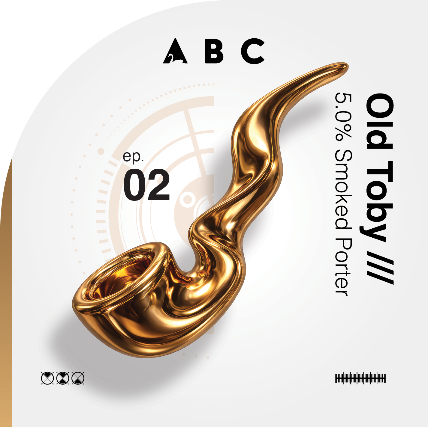
Each beer now has its own unique symbol, built from a flexible system of scientific shapes, blobs and forms. We even carried that thinking into the clip shape itself, moving away from the usual rectangles and ovals to create something that breaks up the bar and pulls the eye in.


THE RESULT
ABC now has a completely new lease of life.
What was once a quieter experimental corner of the Vale range now feels like a proper sub-brand with its own energy, confidence and commercial potential.
The identity works across cask, keg, bottle and can, giving the team a strong platform for future releases and new formats. It gives drinkers something to spot, collect and talk about, while giving trade customers a range that immediately feels different on the bar and on shelf.
The response from customers and trade partners has been fantastic, with people calling out how unique the artwork feels and how strongly it stands apart from more traditional beer branding.
Most importantly, the beers are moving.
ABC now looks as bold as the beers inside it. One brew per month. Never repeated. Proper lab work from Vale Brewery.
TESTIMONIAL
“ABC had always been our place to experiment, but it never really had the visual identity to match. Tim helped us turn it into a proper brand in its own right. It now feels bold, different and full of energy, while still sitting naturally within the Vale Brewery family. The reaction from customers and trade has been brilliant, and it has given us a much stronger platform to grow the range.”
Joe Brouder - Co-Owner of Vale Brewery